How we measure our happiness
Take one moment and try to answer, for yourself, the following question:
How happy are you?
Try to rate it on a scale from 1 to 10. I’ll wait until you’re done.

Now let’s talk about how you came up with your answer.
On the face of it, the question “how happy are you?” is both difficult and almost impossibly ill-defined. Nonetheless, I bet that you were able to come up with a number that felt reasonably accurate for you. This number almost certainly didn’t come from any formula or numerical weighing of different factors, but rather from an instinctive overall feeling of satisfaction with your life.
But what determines this overall feeling? This question, it seems to me, is an important one. Our perception of our own lives has a very real effect on our happiness. So it’s worth trying to figure out what it is that we measure our lives against when we assess their quality.
One angle through which you can examine this issue is by looking for a correlation between wealth and self-reported happiness. After all, nearly all of us put a lot of effort into obtaining money, so apparently money should be a significant contributor to happiness.
And in fact, it’s fairly clear that there is a correlation between wealth and perceived happiness. For example, recent data collected by researchers at the University of Michigan characterizes the relationship like this:

[As reported by The Economist’s Daily Chart blog: here.]
This study looked at 13 different countries, but I should say first off that using the data to comment on the relative happiness levels of different countries is an almost entirely meaningless exercise, as Steven Landsburg describes that pretty well here. What I do think is interesting, though, is the way happiness depends on income within a given country. For simplicity, during the remainder of this post I’ll focus on the USA.
Most people, including the authors of the study in question, will take as the primary conclusion of the above graph that more money equals more happiness, with no sign of satiation. For me, though, what’s more interesting (and more accurate to say) is that self-reported happiness grows logarithmically with income.
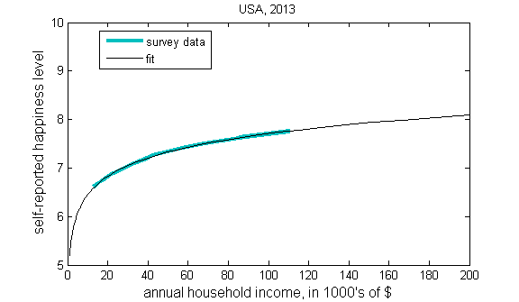
Here, for example, is the same data above for the USA extrapolated to cover a wider range of income:

I should emphasize, in case it’s unclear, that this is a very slow growth. For example, the difference between a $10,000/year income (in the US, this is the bottom 6%) and $100,000/year (the top 20%) is only about 1 point of “happiness.” The far left side of the plot is a $1,000/year household income, and the right side is $10 million/year.
Here is that same curve plotted in a normal (non-logarithmic) scale [UPDATE: These are the exact same lines, just shown with a non-distorted x-axis]:
[In lieu of a stern and much-needed warning about the danger of such extreme extrapolation, I’ll just post this:

Nonetheless I will continue to take the apparent logarithmic dependence seriously.]
One excellent, and not terribly surprising, feature that jumps out from the data above is that every income group rates itself as happier than average (
The real question is, what does this logarithmic growth of “life satisfaction” with income imply about how we assess our happiness?
In general, logarithmic growth occurs when something is measured relative to itself. For example, the plot above suggests that doubling someone’s income will have, on average, the same expected effect on their happiness, regardless of what the person’s salary was to start with. That is, a “poor” person who has their annual salary increased from $10,000 to $20,000 will gain as much in happiness as a “rich” person who has their salary increased from $100,000 to $200,000 (about 0.4 points in each case).
In other words, as the wealth of a person increases, their standards for what constitutes a “better life” seem to increase proportionally. And this is the fundamental reason why happiness increases only logarithmically with an improved standard of living.
If I were a very cynical or very idealistic person, who was inclined to interpret the world through a moral (or religious) lens, I would conclude here by making some ethical or spiritual point. But for me, the elusively shifting standard of human happiness is something interesting rather than depressing. It seems to me, for example, that an alien theorizing about human happiness would anticipate that, since money has a fixed purchasing power, a person should gain a constant amount of happiness from a constant amount of money. But a real person will not be surprised to learn that this is not at all the case. Humans, in some sense, are wired with a constant drive for accomplishment. With each accomplishment a person gains some happiness, and some ability. And as that person’s abilities and prior accomplishments grow, their standard for further accomplishment also grows.
This seems to be a beautiful design of evolution to keep our species alive and at the top of the food chain. And I think it deserves to be celebrated as much as it deserves to be declaimed. It is part of what it means to be human.
Most of all, our proportional measuring of happiness deserves to be recognized and to be understood, especially if we are to attempt to maximize our individual and collective well-being.
Footnotes
1. I personally think that our perception of the passage of time is also a logarithmic process, for similar reasons: psychologically, we weigh lengths of time against our own age.
2. I wonder whether there is something very biologically programmed about our ability to appreciate increases only in proportion. Our physical senses, for example, are subject to the Weber-Fechner law, which says that our sensitivity to small changes decreases in proportion to the magnitude of the sensory stimulus.
For example, you can hear a slight whisper during a silent scene in a movie theater, but in a loud rock concert you won’t be able to perceive anything quieter than a freight train. Similar relations hold for our sense of sight (think of trying to see a faint light in a dark room versus a bright afternoon), touch, smell, and taste.
3. It is perhaps instructive to compare the happiness-vs-income plot to the actual distribution of income in the US. In the same scale as the plot above, that distribution looks like this:
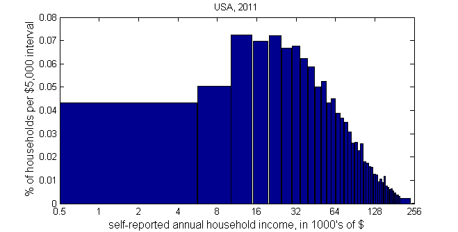
(Data from The US Census Bureau.)
The takeaway message from combining these two plots is like this: If you live in the US, then there is a 90% chance that you belong to a demographic group whose average self-reported happiness is between 6.5 and 8.0.
Please note, by the way, that all income numbers in this post are total household income, and not the salaries of individual jobs.
4. Here is a fun fact related to the “Lake Wobegon Effect”: 93% of Americans consider themselves above-average drivers.

OT, but within this blog’s purview: http://well.blogs.nytimes.com/2013/05/08/are-hot-hands-in-sports-for-real/
You wrote : “For example, the plot above suggests that doubling someone’s income will have, on average, the same expected effect on their happiness…”.
The key word there is “suggests”. The plots in your original graph appear to be average happiness rankings by household income. It is highly likely that the individual plot points were all over the place – a big cloud slightly higher on the right and slightly lower on the left. So doubling someone’s income would move it to the right, and probably move it up. I would hazard a guess that for most people there would be an immediate large increase in happiness, but the amount of that decrease over time.
I’d be interested to see a graph of mean income against self-reported happiness scores to see whether that still supports the conclusion.